Although the Nasdaq is making the CMI look like a mud encrusted hippo with 20+% year to date gains versus the 10+% CMI gains, it is interesting to see a comparison between the two for cummulative year to date gains, or more specifically, how they got to where they are now. The Nasdaq took a big dip prior to it's upward move from the March low while the CMI held steady through that same period of time.
I'm not trying to make excuses for the CMI's slow reaction to the market changes but looking at the chart below, which line would cause you to lose more sleep. The blue Nasdaq line is pushing into the mid-20's but had to recover from a deep drawdown unlike the more steady CMI.
Note that the chart is based on month to month results (Jan 1st to Feb 1st etc.) so there is less turbulence seen here than if the chart was based on day or week fluctuations. The 'smoothing' of these lines was intended because the CMI is a longer term commitment rather than a day or swing trading vehicle. Also the recent increase in the Nasdaq was not recorded on this graph. The divergence between the July results of the Nasdaq and the CMI is greater, favoring the Nasdaq in YTD gains by approx. 14%.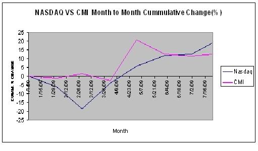

About this Site
 Hello! Sigmund here. Just a quick word about this site. Monkey Throw Dart is an informational site for traders and investors who are looking for a trading strategy that really works. Using a unique trend-following system, originally called the Cheetum Market Indicator 1.0 (CMI 1.0) which has now morphed into a beast called the MensaMonkey, the goal is still the same: Outperform the market with double digit gains every year regardless of market direction.
The stock market will never be a safe place for your savings or trading capital unless you have a plan that includes expert timing, and a good dose of risk management. This site is dedicated to leveling the playing field, or playing jungle as the case may be. No gimmicks or phony promises. Transactions and trading signals are posted as they happen so you can follow along as I sink or swim with every trade.
2013 starts the fifth year of this grand experiment so set your sights on the MensaMonkey's trade signals just below these words because the little primate's market calls are on public display as usual and can change at any time.
To learn more about the MensaMonkey trading, scroll down to the 'Posts By Category' in the sidebar below and look for MensaMonkey, or just click here.
Of course, if you end up losing money due to information posted here, don't blame me. You're the one who took advice from a chimp.
Sigmund's Blog List
-
-
Friday File: Halfway Through!17 hours ago
-
-
-
-
Он раб моды ...1 week ago
-
-
This is the end2 years ago