
I like scatter diagrams. They paint a nice picture when there is a relationship between two sets of data. Take a look at the diagram below.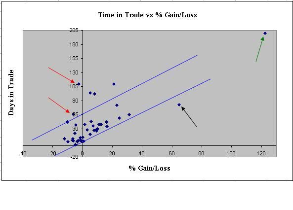
Each dot represents a single trade. The x-axis indicates % gain/loss and the y-axis represents the number of days for each trade. Within the diagonal blue lines are the group of trades that form a pattern showing that the majority of losing trades also were relatively short term trades while the majority of winning trades were longer term.
Some of the outliers are shown here with different colored arrows. The green arrow shows the massive winning trade (122%) from last year which was also the longest trade (200 days). We like those.
See the black arrow. This is another trade that we would like to see more often. It points to a trade that made over 60% in a relatively short amount of time.
The red arrows point to two trades that we would like to avoid. Both arrows represent trades that lasted 65 and 100+ days that ended up on the losing end. Flat market, no doubt.
The information presented here is sort of obvious. In order to generate large gains during one trade usually takes time unless the bottom falls out of the market, or you are on the right side of a raging bull market. More importantly, this scatter (or cluster) diagram illustrates the advantages, and clearly shows the non-random outcome, of a solid trend following system.

The Revenge of the Philosophy Majors
2 hours ago