You've got to be careful if you don't know where you're going 'cause
you might not get there.
~Yogi Berra
Back in the old days (2008) markets used to go up and down so it was important to
check market direction, sector performance and then look at an individual
equity. I do this even now. Well, I general don't pay much attention to
sectors unless I am doing some specific-sector research. With that in mind I recently came across this
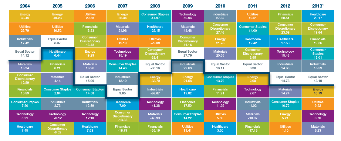
SPDR sector chart that goes all the way back to 2004.
I'm attracted to
shiny objects and bright colors so this chart kept my attention as I mixed and
matched these colored cells finding several patterns, even some that don't really exist.
I get the whole equal sector strategy. Just looks at the white cells in the chart
and the one-to-ten year chart at the bottom of the first page in the actual .pdf version. Although we may never see another 2008 (I'm
lying, again) you can see how the best performing sector took a 15% beating
that year, and unless you found yourself in a few inverse ETF's or cash (any
port in a storm) you would have been lucky to have taken a 15% hit by the end of
2008.
I'm not so sure that the next market collapse will be so
kind regarding its time span and magnitude, and you can be sure that it will
happen at the most inopportune time.
Not surprisingly, this colorful SPDR "periodic
table" was created to sell an equal weight sector strategy, but instead I
took it as a reminder of why I disregard blind faith as an investing strategy.