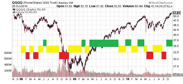
 Creating oscillating, trending, and neutrals 'zones' on a price chart is easy after price happens. Creating a system that does this before the fact is more of a challenge. The chart below shows three areas or types of anticipated price action created using standard deviation and some smoothed rate of change data. The red boxes indicate high volatility trending zones, green boxes indicated low volatility trend zones, and the yellow boxes indicate areas of potential oscillation.
This model of price action does not necessarily predict but instead tracks expected market action as it happens. These signals are not used to trade but act as a 'gate' that rejects or accepts the quicker signals when they appear.
This may help alleviate the two common issues when dealing with typical trend following indicators:
i. longer term, incorrect signals triggered by one or two days of high volatility, and
ii. erratic, noisy signals that are generated when longer term signals are used during oscillating market periods, and short term signals that are used during trending markets. To be continued...
____________________________________________________
Looking at these charts for extended periods of time remind me of those 3D computer generated pictures that were popular in the early 90's. You remember...Pearl Jam, Nirvana, and 3D pictures that you stare at until another picture appears before your eyes.
Didn't you hate the monkey who would always be looking over your shoulder saying,
"Do you see it, do you see it, don't you see it yet?"
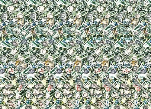
Here's an example if you haven't seen one in a while. Just look cross-eyed, through your computer monitor...
A three dimensional picture hidden within a two dimensional picture. The parallels that can be drawn between these advanced stereograms and the stock market are numerous.
Do you see it, do you see it???
I'll give you a hint. It's a big dollar symbol, plain as day.
Do you see it yet!?
Trump’s Stone Age Threat Will Lead to Tragedy
2 hours ago

