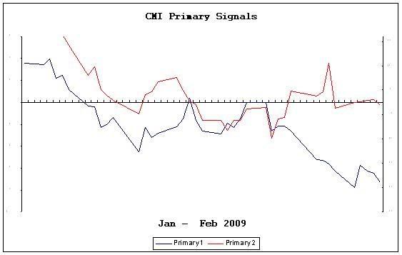
Here is a basic chart showing the trend of the Cheetum Market Index. The red and the blue lines are primary indicators that must be on the same side of the horizontal "0" line in order to signal a buy of either the QLD or the QID. Red and blue lines above the horizontal line indicate a buy of the QLD whereas red and blue below the horizontal indicate a buy of the QID. The red line must also hold it's position on one side of the horizontal line for three consecutive days in order to verify the signal. It's important to note that these lines show where the CMI was, not necessarily where it is going although this graph is helpful as it does show a directional bias.
I will update this on a regular basis, or if others find it helpful, I'll post it more often. Currently, I look at the numbers that are used to generate this graph so the graph is just a show and tell piece.
At some point, I will compare this graph to last year. This may help illustrate the differences in results as we go forward.

About this Site
 Hello! Sigmund here. Just a quick word about this site. Monkey Throw Dart is an informational site for traders and investors who are looking for a trading strategy that really works. Using a unique trend-following system, originally called the Cheetum Market Indicator 1.0 (CMI 1.0) which has now morphed into a beast called the MensaMonkey, the goal is still the same: Outperform the market with double digit gains every year regardless of market direction.
The stock market will never be a safe place for your savings or trading capital unless you have a plan that includes expert timing, and a good dose of risk management. This site is dedicated to leveling the playing field, or playing jungle as the case may be. No gimmicks or phony promises. Transactions and trading signals are posted as they happen so you can follow along as I sink or swim with every trade.
2013 starts the fifth year of this grand experiment so set your sights on the MensaMonkey's trade signals just below these words because the little primate's market calls are on public display as usual and can change at any time.
To learn more about the MensaMonkey trading, scroll down to the 'Posts By Category' in the sidebar below and look for MensaMonkey, or just click here.
Of course, if you end up losing money due to information posted here, don't blame me. You're the one who took advice from a chimp.
Sigmund's Blog List
-
-
-
-
-
-
Он раб моды ...2 weeks ago
-
-
This is the end2 years ago