
"There are three kinds of lies: lies, damn lies, and statistics."
~Benjamin Disraeli
Take a look at the chart below. It is a frequency graph that shows winning trades and losing trades only. Each winning trade is represented by a blue "point" above zero. The losing trades are represented by a "point" below zero.
Showing only frequency rather than amplitude, or the % gain or % loss of each trade, allows the trader to focus on winning percentage only. At first glance, I would be skeptical of any system that appears to show one winning trade for every losing trade. Through back testing and actual trading, the CMI 2.0 has a 56% winning percentage. This can be easily seen here.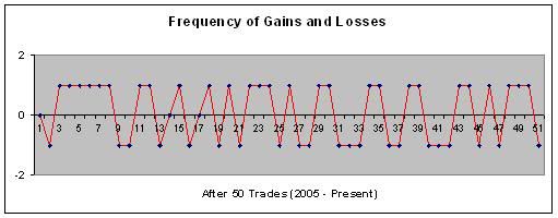
The point of all these "points" is to lead us to the question of amplitude. Do the winning trades outperform the losing trades, or are they all same which would make this method a zero sum game? To answer this, I would adjust the graph by changing the y-axis from zeros and ones to % gain/loss for each "point". Rather than do this I have skipped ahead since I already know that for every dollar lost in a losing trade, four dollars are gained in a winning. Over the course of five years this has been the case. Of course, there are no guarantees that this will continue, but humor me for now.
Let's, instead, do what every mutual fund company does and show what happens to a $10,000 investment after five years of compounding gains and losses for every CMI trade.
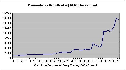
Impressed yet? This represents 50 CMI trades. For those who are more logarithmically inclined...
The logarithmic chart does paint a more accurate picture from my point of view. Although I didn't note the years in the x axis, it is very obvious the the 2008 downturn and the 2009 reversal added some serious horsepower to the overall result.
The average annual percent results for the CMI are stated in the sidebar. 62% is the average annual gain from 2005 to 2009 but as they say, "the mean can be mean". Annual gains for each year since 2005 are as follows:
2005: 35.9%
2006: 23.0%
2007: 26.1%
2008: 106.3%
2009: 128.2%
2005 to 2007 were rather lackluster (there I go complaining about making money again) but as with intra-year trading, you have to play to win, or in this case, wait to win. The additional annual data below shows, just like the graphs, that the historical drawdowns pale in comparison to the gains.
2005
9 trades
largest gain: 16.0%
largest loss: -10.0%
2006
12 trades
largest gain: 12.0%
largest loss: -5.0%
2007
7 trades
largest gain: 20.9%
largest loss: -6.9%
2008
13 trades
largest gain: 64.7%
largest loss: -12.2%
2009
5 trades
largest gain: 122.4%
largest loss: -10.3%
