The price/earning ratio is defined as a valuation ratio of a company's current share price compared to its per share earnings.
For example, if a company is currently trading at $20 a share and earnings over the last 12 months were $1.15 per share, the P/E ratio for the stock would be 17.39 ($20/$1.15).
Since these ratios fluctuate and are tracked as an average for the indices, it would be interesting to see if there is any a way to use this data to predict future movements of the S&P 500.
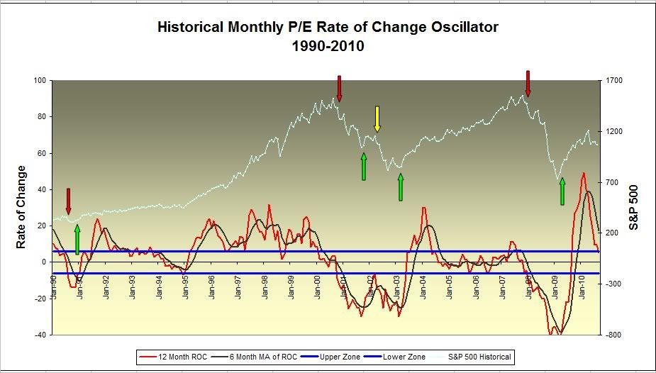
Using monthly data for the S&P, I placed the month-to-month P/E data on a chart along with an overlay of the S&P prices going back 20 years. The data followed price for the most part except for a stretch of years between 2004 and 2008. Nothing too predictive here. Not satisfied with those results, I then applied a basic 12 month rate of change formula and smoothed that with a 6 period moving average.
Take a look at the following chart...
The light blue line at the top represents the S&P price data over the 20 year period. At the bottom, the red line represents the 12 month rate of change results using the monthly P/E data.
The smoother black line represents the 6 period moving average of the rate of change line.
The two blue horizontal lines indicate the high and low limits of the "zero" zone. This zone eliminates all that noise around the zero line.
How do you determine buy and sell? Glad you asked. The rules are simple as long as you are not color blind:
1. A cross of the red ROC line over the black moving average line from below when both lines are below the lower blue horizontal line triggers a 'buy' signal.
Solid confirmation occurs when both the red and black lines cross through the zero line and then continue above the upper blue line. A reversal of the red line prior to crossing through the 'zone' would trigger a sell signal as noted by the yellow arrow.
2. A cross of the red line below the bottom horizontal blue line triggers a 'sell' signal. The black moving average line is not used as an indication of a sell.
3. If the lines are in the 'zero' zone (between the blue horizontal lines, continue with the previous trend. In other words, if they are in the zone, leave 'em alone.
Obviously, with only eight signals triggered in the last 20 years, this oscillator is only useful for those who are looking for an extended time frame. Let's see if these rules hold up over the next few months. If that red line drops like a rock through the bottom blue horizontal line, I'll have my finger on the sell button.
Historical S&P P/E data provided by Robert J. Schiller, PhD.
“Looking To Become Royalty Royalty” Pitch
1 hour ago

