Here's a look at the recent changes to the Cheetum Market Indicator...from 30,000 feet. Actually, the three large horizontal lines are a zoomed out view of S&P 500 trading signals over the last four years. Five signals are contained in each of the three fat horizontal lines.
The signals are supposed to work together, and they do for the most part. The green colors indicate buy signals and the reddish colors indicate sell signals. The color changes run fairly close to the actual, longer-term market direction changes.
Only those pesky red spots remain. Each one of those cost $$ as they tend to generate false signals. The good news is that there is a pattern as to why they show up. If I can remove 70% of them, it will be one small step for a monkey, one giant leap for monkeykind.
Sometimes problem solving requires a wide-angle perspective.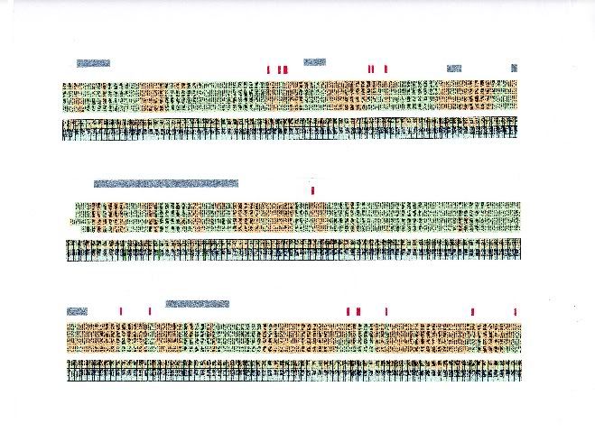
On a tangential note, apparently they found the missing "a" a few years ago. Why wasn't I informed? Now what's left? Bigfoot...Loch Ness monster, and the real reason for Fat Finger Thursday?

About this Site
 Hello! Sigmund here. Just a quick word about this site. Monkey Throw Dart is an informational site for traders and investors who are looking for a trading strategy that really works. Using a unique trend-following system, originally called the Cheetum Market Indicator 1.0 (CMI 1.0) which has now morphed into a beast called the MensaMonkey, the goal is still the same: Outperform the market with double digit gains every year regardless of market direction.
The stock market will never be a safe place for your savings or trading capital unless you have a plan that includes expert timing, and a good dose of risk management. This site is dedicated to leveling the playing field, or playing jungle as the case may be. No gimmicks or phony promises. Transactions and trading signals are posted as they happen so you can follow along as I sink or swim with every trade.
2013 starts the fifth year of this grand experiment so set your sights on the MensaMonkey's trade signals just below these words because the little primate's market calls are on public display as usual and can change at any time.
To learn more about the MensaMonkey trading, scroll down to the 'Posts By Category' in the sidebar below and look for MensaMonkey, or just click here.
Of course, if you end up losing money due to information posted here, don't blame me. You're the one who took advice from a chimp.
Sigmund's Blog List
-
-
-
-
-
-
Он раб моды ...1 week ago
-
-
This is the end2 years ago